- HS - Head + Shoulders
- IHS - Inverted Head + Shoulders
- QM - Quasimodo
- IQM - Inverted Quasimodo
- RS - Right Shoulder
- HL - Horizontal Line
- TL - Trend Line
- TT - Trend Trade
- CT - Counter Trend
- SBR - Support Becomes Resistance
- RBS - Resistance Becomes Support
- TF - Time Frame
- 00 - Round Number
- T+S - Time & Space
- PDH - Previous Daily High
- PDL - Previous Daily Low
- BB - Bucket Bottom
- PB - Pin Bar
- SB - Spike Base
- TW - Tweezers
- RRT - Rail Road Tracks
- S/R - Support & Resistance
- B/E - Break even
- PRT - ProRealTime
- BO - Break out
- FL - Flag
- DT - Double Top
- DB - Double Bottom
- TDA - Top Down Analysis
- TLA - Three Letter Acronym!
Wednesday, 20 January 2010
6. Abbreviations
For simplicity I use a lot of abbreviations when I talk about trading conditions: -
Tuesday, 19 January 2010
5. Trading Zones

The easiest way to do this is to use the candle wicks from the last time price was at this level so that the tip of the wick and the candle body become your target zone, if one exists last time price was at the level.
My preferred method results from using the top down analysis described in the last post. I often end up with these ranges defined for me by levels from different time frames by the time I get down to the 1 hour chart.
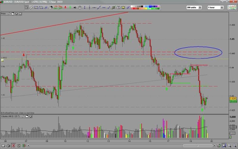
In the EURUSD chart above, my target area 14446-14455 circled in blue, was defined by the lower, thinner 1 hour s/r level and the upper, thicker 4hour level. An entry any where between these two would have made me happy. Unfortunately a poor news report on top of existing economic pressure made price fall much earlier.
In the EURUSD chart above, my target area 14446-14455 circled in blue, was defined by the lower, thinner 1 hour s/r level and the upper, thicker 4hour level. An entry any where between these two would have made me happy. Unfortunately a poor news report on top of existing economic pressure made price fall much earlier.
Wider ranges defined by multiple levels can be more difficult to deal with, and a concious decision has to be made as to whether an entry is better at the front of the range or the back. There are many theories on this, some say the front of a range is better when entering a trend trade and the back is better for counter trend. Similarly the front may be better if you are using a flat pattern such as a bucket bottom. Momentum and price action needs to be considered as well so I suggest you study this and come up with your own ideal combinations.
The other important point is that I almost always make an adjustment to my entry to take into account the spread and a small price shortfall. So when I say the back of a range it will usually be a few pips away.
Monday, 18 January 2010
4. Identifying Demand and Supply Levels
Top Down Analysis - this is the industry term for what I do, work from the higher time frames downward placing demand and supply levels as I go. By the time I have finished my key TF of 1 hour it should all make sense.
I'm sure you are already actually very proficient at placing your levels but you want to be able to do it better and identify the levels that really matter. Well the main problem is that demand and supply is everywhere and it is easy to cover your charts with lines, unfortunately most of this is just noise that hides what is really going on. Starting with the highest time frames first helps cut down on this noise and allows us to know which TF the level comes from - critical when you are trying to judge an entry or work out how long the reversal might take to complete.
It is often said, the higher the time frame the more significant the level, but also the higher the time frame the wider the influence that level can have. It is possible to get into a trade right at a 1 hour level, but how often does price reverse 15-20 pips away from a daily level? Everything is scaled up, a swing trader using a daily chart aims for hundreds of pips per trade, has a much larger stop than us intraday traders and would think nothing of entering 15-20 pips away from a price level because he/she doesn't want to miss the bus. To reflect this I now use lines of different thickness for each time frame instead of colour coding them to remind me that higher TF levels are more ambiguous.
Here is a short video showing a simplified version of what I typically do to set up my charts for a trading session.
The embedded video has been a problem so if it doesn't work
Subscribe to:
Comments (Atom)